Graphic Design
Branding an eCommerce Brand From Packaging to Instagram: A Practical Checklist
5 October 2026 · 6 min read
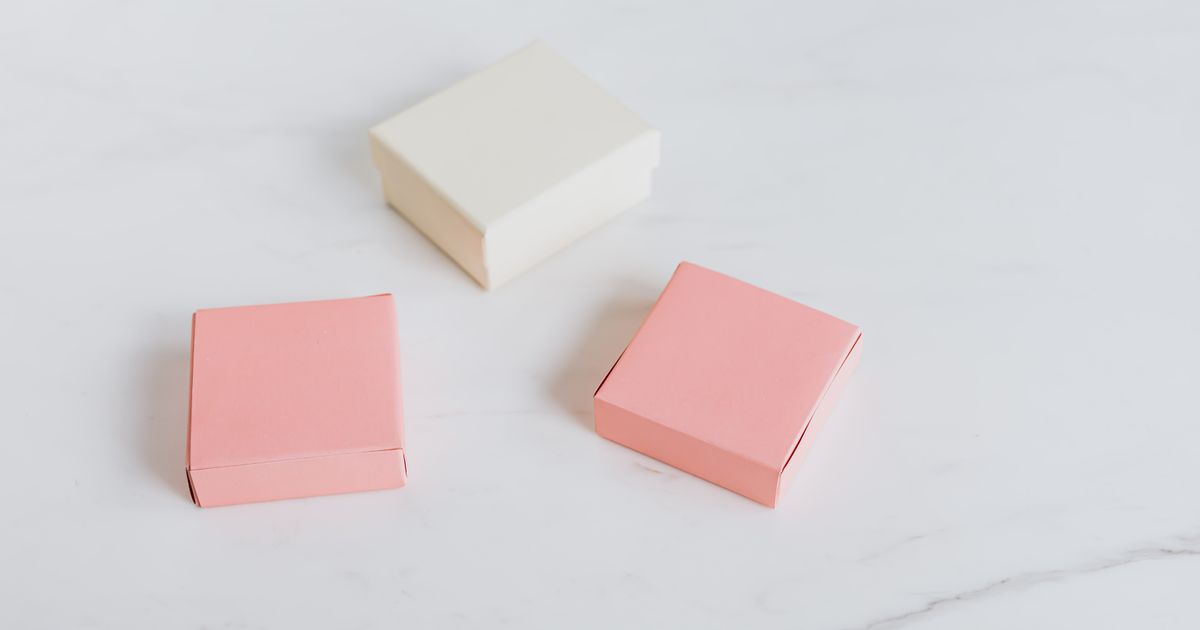
If you're building an eCommerce brand, you've probably noticed that "branding" gets used to mean about six different things depending on who's talking. A designer means your logo and colour palette. A packaging supplier means what goes on the box. A marketer means your tone of voice in emails. Your customer just means "does this feel like a real, trustworthy business when I land on the product page at 11pm on my phone."
That last definition is the one that actually matters, and it's also the one most small eCommerce brands get wrong — not because the individual pieces are bad, but because they were never built to work together. A nice logo, inconsistent packaging, and email marketing that looks like it belongs to a different company entirely. Each piece might be fine in isolation. The whole doesn't hold up.
This is a practical checklist for getting those pieces to actually agree with each other, in the order we'd tackle them with a new eCommerce client.
Start with the five decisions that touch everything else
Before any design work happens, there are five things worth pinning down, because changing them later means redoing everything built on top:
- Your core colour palette — two to three colours, not a mood board. If you can't name them without opening a file, they're not decided yet.
- Your typeface pairing — one for headlines, one for body copy. Consistent across packaging, website, and email.
- Your tone of voice — are you the brand that writes "we reckon you'll love this" or "this product has been engineered for..."? Pick one register and keep it.
- Your product photography style — flat lay on a plain background, lifestyle shots in use, or a mix? This decision affects your website, your packaging mockups, and every social post.
- What you actually stand for — not a mission statement for its own sake, but the one or two things a customer should associate with you after one purchase. Fast shipping? Sustainable materials? Founder-led quality control? Pick what's true, not what sounds good.
Skip this stage and you'll end up redesigning packaging six months after your first print run because the website moved on without it.
Packaging: where the brand has to work without a screen
Packaging does something your website and emails can't — it has to communicate everything about your brand in the few seconds someone's holding the product, with no scrolling, no click-through, no second chance.
What actually matters on the box or bag:
- Shelf presence at a glance. If a customer can't tell what the product is and who it's for within a second or two, the design hasn't done its job — this matters even for online-only brands, because thumbnail images in search results and marketplaces work the same way.
- Consistency across your range, with room for difference. If you sell multiple flavours, scents, or variants, you need a system — shared layout, swapped colour — not six unrelated designs that happen to share a logo. We put together a concept set spanning snack, drink, and skincare packaging specifically to show how that balance works across genuinely different product categories.
- Unboxing as marketing, not an afterthought. Even a simple printed tissue sheet or a consistent box interior colour turns the unboxing moment into content your customers post for you, for free.
The mistake we see most often: founders spend weeks on the website and then brief packaging as an afterthought, treating it as "just put the logo on it." Packaging is frequently the first and most physical touchpoint a customer has with your brand — it deserves the same thought as the homepage.
Instagram and social: consistency, not just a content calendar
Social media for an eCommerce brand isn't really about posting frequency — it's about whether someone scrolling past your grid for two seconds recognises it as one brand, not four.
What keeps a feed coherent:
- A repeatable photo treatment. Same lighting style, same background choices, same crop ratios. This doesn't mean every photo looks identical — it means they clearly belong to the same family.
- A caption voice that matches your website copy. If your product pages are written in a warm, direct tone and your Instagram captions are stiff and corporate (or the reverse), that mismatch registers with customers even if they can't articulate why.
- Product photography that matches packaging photography. If your packaging design uses a particular colour story or illustration style, your social content should echo it, not ignore it.
A genuinely common failure mode: a brand's packaging is confident and distinctive, but its Instagram grid looks like generic stock photography because content got outsourced separately with no shared brief. The fix isn't more posts — it's one shared visual brief that packaging, photography, and social content are all measured against.
Email marketing: the one channel that's supposed to feel personal
Email is where a lot of eCommerce brands accidentally undo their own branding work, because email templates default to generic layouts that don't reflect any of the decisions made for packaging or the website.
Where to focus:
- Template design that echoes your site, not your email platform's default theme. Same colours, same typography, same button style as your product pages — not whatever came pre-loaded in your email tool.
- A welcome sequence that actually explains what you stand for. This is the single highest-value piece of email content for a new eCommerce brand, and it's the natural place to deliver the "what we stand for" decision from earlier — not just a discount code.
- Consistent sending cadence and tone, so your emails don't read like three different people are writing them depending on the week.
If you're not sure how often to actually send, that's a genuinely common question with a concrete answer rather than a vague "stay consistent" — worth tackling as its own topic, because the right cadence depends more on your catalogue size and purchase frequency than general best-practice advice admits.
Pulling it together: a realistic order of operations
For a brand starting from scratch or fixing inconsistency across an existing one, here's the order that avoids expensive rework:
- Lock the five foundational decisions above.
- Design packaging first if you sell a physical product — it's the most expensive to change later once you've printed stock.
- Build or update the website and product photography to match.
- Set up email templates using the same visual language.
- Brief social content last, using packaging and product photography as the reference point, not a separate mood board.
Doing it in reverse order — social content first, packaging as an afterthought — is the most common reason eCommerce brands end up with a strong online presence that doesn't match what arrives in the post.
Where to go from here
If you're setting this up for the first time, our graphic design services cover packaging, brand identity, and the visual system that ties everything together, and our email marketing services handle the templates and sequences that should match it. If you want to see how a consistent system looks across genuinely different product types, the packaging concept set in our portfolio is a useful reference point.
And if you're not sure where your brand's inconsistencies actually are — that's exactly what a discovery call is for. Bring your packaging, your website, and your last few emails, and we'll tell you honestly where they stop agreeing with each other.